Diagrams and Graphic Presentation of Frequency Distribution
Subject: Business Statistics

Overview
Graphs are used to represent any objects or concepts schematically. It is utilized to convert frequency distribution from a tabular form to a visual representation. The information is presented in a simple and understandable way. An example of a graph that shows continuous data is a histogram. In situations where the entire values of the data at any particular period are needed, an ogive is a graph that displays cumulative frequencies.
Diagrams and Graphs:
Diagrams are a thing's schematic depiction. It demonstrates the appearances, structure, and operation of something (which could represent any object or subject).
The graph is a diagram that depicts the relationship between two variables that are typically measured at right angles on distinct axes. We utilize various forms of graphs and diagrams to describe the frequency distribution because they are more effective visual representations of it than tables are.
Types of Graphs:
- Bar graph: An illustration of the frequency distribution for qualitative or categorical data is a bar graph.
- Histogram: A graph that displays the frequency distribution of numerical data is called a histogram.
- Ogive: Ogive is a graph that displays the overall frequency for numerical data.
- Frequency polygon: A graph that displays frequency for quantitative data is called a frequency polygon.
Importance of Graphs:
- Depicts the data in a visual manner.
- They are beautiful in presentation and simple to grasp.
- They can be used to a variety of fields, including math, physics, social science, and others.
- They support the decision-making and data analysis processes.
Histogram:
A histogram is a bar graph that graphically displays frequency tables. An illustration of the underlying frequency distribution (shape) of a set of continuous data is a histogram. The variable being measured in the data set makes up the horizontal axis of a histogram, and the class frequency makes up the vertical axis. A vertical bar with a height equal to the class frequency and a width equal to the class width is used to represent each data class. In project management and many other fields where data analysis is done, a histogram is a fantastic tool. A histogram gives you a quick and simple way to get the overall picture of the data since it gives you a snapshot of all the data. This is useful in business as it saves time in analysis of data.
A histogram consists of:
Scale: Represents class boundaries or class midpoints.
Vertical/horizontal bars: Show the frequencies of each class.
Steps to draw a histogram using a Frequency distribution table.
- Place the frequencies along the vertical axis. Insert the word "Frequency" here.
- The lower boundary of each interval should be placed on the horizontal axis. The kind of data displayed should be labeled on this axis.
- From the lower limit of one interval to the lower limit of the following interval, draw a bar. Each bar's height should match the frequency of the interval it represents.
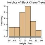
Example 1:
Let us understand histogram by this simple example where the number of black cherry trees in a garden according to their height(in feet) is given.
67,63,64,68,68,61,86,81,87,81,82,83,84,76,78,77,71,70,79,71,72,73,72,74,71,75,76,78,77,76,79
Now , at first we have to create a frequency distribution table as follows:
The numbers ranges from 61-87 which is roughly from 60-90 so we can divide this into 6 intervals of equal width 5 i.e, 60-64,65-69,70-74,75-79,80-84 and 85-89.Then we can count the number of data points which fall into each interval and create a frequency table.
| Intervals | Frequency |
| 60-64 | 3 |
| 65-69 | 3 |
| 70-74 | 8 |
| 75-79 | 10 |
| 80-84 | 5 |
| 85-89 | 2 |
With the help of the above frequency table the intervals are kept in the horizontal line and their corresponding frequency on the vertical line.
Difference between Histogram and Bar Graph:
- The type of data that each graph represents is the main distinction between a histogram and a bar graph. Histograms show continuous data, while bar graphs show categorical data.
- As an illustration, suppose that someone offered to buy ice cream for you and your friends. You chose the flavor based on your preferences, and the data was then categorized using a bar graph.
- Where as If you weigh a group of adults, the results could range from, say, 90 pounds to 240 pounds. Since the weights are continuous but the same kind, we use histograms for this.
- Another distinction is that bar graphs might have space between the bars or not, whereas histograms are always shown with space between the bars.
Frequency Polygon:
The data in a frequency table is shown as a line graph in a frequency polygon.
Ogive:
A frequency polygon that displays cumulative frequencies is called an ogive, sometimes known as a cumulative frequency polygon. An ogive is a graph in which the y-axis represents cumulative frequency and the x-axis represents class boundaries. Usually, making an ogive from a frequency table is simpler. At the lower limit of the first class, Ogive always starts on the left with a cumulative frequency of zero. The cumulative frequency at the upper-limit of the last class should equal the total sample size at the right-hand end of the ogive. When you want to display the total values of data at any particular time, Ogive is utilized.
Types of Ogive:
- Less than ogive: The ogive in which the less-than-cumulative frequency distribution graph or curve is displayed, displaying the number of observations LESS THAN the upper-class border.
- More than Ogive: The ogive, which displays the number of observations GREATER THAN the lower-class boundary, is the graph or curve of the greater than cumulative frequency distribution.
Steps to draw an ogive curve using a frequency distribution table:
- Place the frequencies along the vertical axis. Insert the word "Frequency" here.
- The lower boundary of each interval should be placed on the horizontal axis. The type of data shown (e.g., the cost of birthday cards) should be indicated on this axis.
- Plot the graph's very first coordinate, which begins at 0.
- At the conclusion of the first interval, plot the second coordinate.
- At the conclusion of the second interval, plot the third coordinate, and so on.
Example 2:
Marks obtained by the students of a class in statistics test are :
| Marks | 0 – 10 | 10 – 20 | 20 – 30 | 30 – 40 | 40 – 50 |
| Number of students | 4 | 8 | 18 | 15 | 5 |
Draw ‘less than’ and ‘more than’ ogives.
Solutions: First, the ‘less than and ‘more than’ cumulative frequencies will be calculated and the ogives will be drawn on the basis of these cumulative frequencies.
Calculation Of Cumulative Frequencies:
| Marks | Frequency | ‘Less than’ Cumulative Frequency | ‘More than’ Cumulative Frequency |
| 0 – 10
10 – 20 20 – 30 30 – 40 40 – 50 |
4
8 18 15 5 |
4
12 30 45 50 |
50
46 38 20 5 |
Refrences:
- mathsteacher.com.au/year8/ch17_stat/03_freq/freq.htm
- everythingmaths.co.za/maths/grade-11/11-statistics/11-statistics-03.cnxmlplus
- needmathhelp.wordpress.com/2013/02/21/how-to-construct-an-ogive/
Things to remember title
- Diagrams are a thing's schematic depiction. It demonstrates the appearances, structure, and operation of something (which could represent any object or subject).
- The graph is a diagram that depicts the relationship between two variables that are typically measured at right angles on distinct axes.
- Among the limited types of graphs, there are bar graphs, histograms, and ogives.
- When analyzing data and making decisions, the graph is utilized to portray the data in an appealing way.
- A histogram is a bar graph that graphically displays frequency tables.
- An illustration of the underlying frequency distribution (shape) of a set of continuous data is a histogram.
- Histograms show continuous data, while bar graphs show categorical data.
- The data in a frequency table is shown as a line graph in a frequency polygon.
- A frequency polygon that displays cumulative frequencies is called an ogive, sometimes known as a cumulative frequency polygon.
- Less than ogive: The ogive in which the graph or curve of the cumulative frequency distribution with fewer observations than the upper-class boundary is displayed.
- More than Ogive: The graph or curve of the greater than cumulative frequency distribution known as the "more than Ogive" represents the number of observations that are greater than the lower-class limit.
© 2021 Saralmind. All Rights Reserved.
 Login with google