Frequency Distribution-Stem and Leaf Plots
Subject: Business Statistics

Overview
A frequency distribution is a table-based structure of unprocessed data. Data and data frequency are included in the table. It is employed to arrange the data and evaluate various data sets. Numerous frequency distribution table kinds, both quantitative and qualitative, can be further divided into categorized, grouped, and ungrouped categories. A table called a stem and leaf plot divides each data value into a "stem" (which is the first digit) and a "leaf" (usually the last digit).
The arrangement of raw data (facts and figures) into a table with two columns—one for the data and the other for the frequencies for each category—is known as a frequency distribution. It is a table that serves as a data set description.
Example 1: Statistics exam grades. Suppose that 20 students’ scores in statistics on an exam are given below:
96, 92, 87, 76, 83, 67, 87, 55, 72, 78, 88, 91, 57, 62, 67, 73, 85, 84, 95, 45
We can construct a frequency table with classes 90-99,
80-89, 70-79 etc. by counting the number of grades in each grade range.
|
Class |
Frequency ( f ) |
|
90-99 |
4 |
|
80-89 |
6 |
|
70-79 |
4 |
|
60-69 |
3 |
|
50-59 |
2 |
|
40-49 |
1 |
The sum of frequency is equal to 20 which is the total number of scores.
Basic Terminologies
- Frequency: In each class, it is the total number of data values. The number of students scoring between 90 and 99 in the aforementioned case is 4.
- Lower Class Limit: A class's lowest possible value. The lower class limitations in the aforementioned example are 40, 50, 60, 70, 80, and 90.
- Upper-Class Limit: A class's greatest possible value. 49, 59, 69, 79, 89, and 99 are the upper class boundaries in the example above.
- Class Width: Class width is the distinction between consecutive classes' top and lower class bounds. The class width for each class ought to be the same. The class width in the aforementioned example is 10.
- Class Midpoint: The midpoint of each data class. Calculate the average of the lower and upper class limits to determine the class midpoint.
Types of Frequency Distributions
Qualitative Data:
- A two-column chart with the first column containing a list of categories and the second column containing a count of the amount of data is used to represent a categorical frequency distribution. An illustration would be a table with several levels of employment, such as none, part-time, and full-time, in the first column and the number of employees in each category in the second column.
Quantitative Data:
- A graph called a grouped frequency distribution shows the possible values of the data in the first column and the count of the data that make up each conceivable value in the second column. Example 1 above is an illustration of clustered frequency distribution.
- The ungrouped frequency distribution is a graph that shows the count of the number of data points that have each unique conceivable value in the first column and the second column. For instance, the first column shows the number of books a student is carrying as 0, 1, 2, 3, etc. The number of pupils who have that many books is listed in the second column.
Steps to create a frequency table:
- Decide on the number of data classes to use.
- Divide the range of the data by the number of classes to get an estimate of class width.
- i.e, width=range/number of classes
- Decide on class bounds.
- Construct the frequency table by counting the number of data values in each class.
Example 2:
The number of calls from a house per day was recorded for the month of December 2015. The results were as follows:
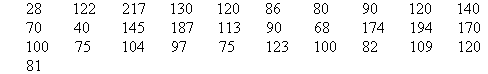
Set up a frequency table for this set of data values.
Solution:
To construct a frequency table, we proceed as follows:
Smallest value=28
Largest value=217
Range=217-28=189
Let, the estimated number of class is 5
So, Width=range/number of class
=189/5
=40(approx)
Now, we create the table with width 40 for each class
| Class | Frequency |
| 0-39 | 1 |
| 40-79 | 5 |
| 80-119 | 12 |
| 120-159 | 8 |
| 160-199 | 4 |
| 200-239 | 1 |
Here, the total frequency is 31 which is equal to the number of students.
Cumulative Frequency:
The total number of items in a data class, including all previous classes, is the cumulative frequency of that class. This may be done in any sequence.
Example 3:
|
Class |
Frequency ( f ) |
Cumulative Frequency |
|
90-99 |
4 |
4 |
|
80-89 |
6 |
10 |
|
70-79 |
4 |
14 |
|
60-69 |
3 |
17 |
|
50-59 |
2 |
19 |
|
40-49 |
1 |
20 |
The last entry of the cumulative frequency column is n=20 which is the sum of frequencies of column 2.
Relative Frequency:
The proportion of data elements in a data class is its relative frequency. The following formula can be used to determine each class's relative frequency:
Example 4:
|
Class |
Frequency ( f ) |
Cumulative Frequency |
Relative Frequency (f / n) |
|
90-99 |
4 |
4 |
.20 |
|
80-89 |
6 |
10 |
.30 |
|
70-79 |
4 |
14 |
.20 |
|
60-69 |
3 |
17 |
.15 |
|
50-59 |
2 |
19 |
.10 |
|
40-49 |
1 |
20 |
.05 |
The sum of relative frequencies should be equal to 1.
i.e,\(\sum (\frac{f}{n}\))=1
Importance of Frequency Distribution:
- The facts are better arranged for understanding.
- Comparing diverse data sets is beneficial.
- To ascertain the distribution's form.
- To create various data graphs and charts.
Stem and Leaf Plots:
A table called a stem and leaf plot divides each data value into a "stem" (which is the first digit) and a "leaf" (usually the last digit).
Typically, the number at position 10 is regarded as the stem, and the number at position 1 is regarded as the leaf.
Example 5:
Let us take an example data set 15,16,21,23,23,26,26,30,32,41
Now, the "stem" values are listed down, and the "leaf" values go right (or left) from the stem values.
The "stem" is used to group the scores and each "leaf" shows the individual scores within each group.
Stem Leaf:
1 5,6
2 1,3,3,6,6
3 0,2
4 1
It is better to use graph paper to plot the stem and leaf plots for clarity.
- mathsteacher.com.au/year8/ch17_stat/03_freq/freq.htm
- https://www.google.com.np/urlsa=t&rct=j&q=&esrc=s&source=web&cd=3&cad=rja&uact=8&ved=0ahUKEwjuxcmw2MXOAhWIL48KHWRGBi0QFggnMAI&url=http://bk.psu.edu/clt/Stat200/Chapter2_Printable.pdf&usg=AFQjCNF3E34lXCwSenw9gyjMCjFpWo_U1A&sig2=VhFfHS0OK1MIahCDv7l-CA
Things to remember title
- The arrangement of raw data (facts and figures) into a table with two columns—one for the data and the other for the frequencies for each category—is known as a frequency distribution.
- It is a table that serves as a data set description.
- Its frequency is the total number of data values in each class.
- A class's lower class limit is the lowest value that can be assigned to it.
- The upper-class limit of a class is its maximum value.
- Class width is the difference between successive classes' upper and lower bounds.
- Every data class's midway is represented by its middle value.
- The total number of items in all prior classes plus the current class, in whatever sequence, make up the cumulative frequency of a data class.
- The proportion of data elements in a data class is its relative frequency.
- A table called a stem and leaf plot divides each data value into a "stem" (which is the first digit) and a "leaf" (usually the last digit).
- Typically, the number at position 10 is regarded as the stem, and the number at position 1 is regarded as the leaf.
© 2021 Saralmind. All Rights Reserved.
 Login with google